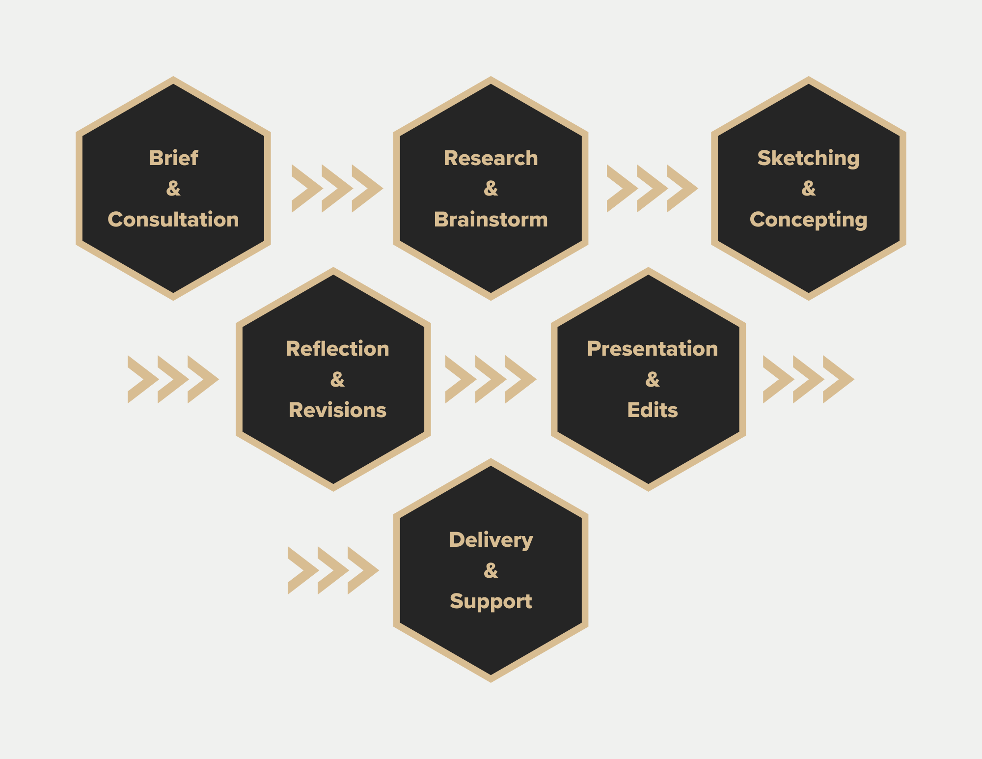
Process
As a self-taught designer, my design and work process is something I’ve developed through the years as an approach that can be described as direct but effective. Below is a selection of some of my work and the thought process behind my choices.
LOGOS
I approach my logo philosophy by focusing on strong visual symbolism and elements. I also make sure that the art and design are clear about what it represents without making them overly complicated. I like clean and simple designs that work on multiple levels.
Geek fuzion labs
-

Geek
-

Fuzion
-

Labs
The name Geek Fuzion Labs comes from the geek identity I have, and fuzing it with the media labs suite of services I am offering. Instead of going with the typical geeky ideas and motifs, I explored the concept of fuzing three letters into one design and letting the audience discover the hidden elements in it.
MONOGRAM DUAL Identity
-

Christian
First letter of first name
-

Jimenez
Final letter of last name
In addition to what the logo already represents, it also has a dual identity of being a monogram of my name, Christian Jimenez. The many layers a logo can have is important to my design philosophy as it conveys that careful thought and attention were used.
The Paris Connexion
-

Connexion
-

Paris
-

The Seine
The Paris Connexion icon also has many layers. The outer 5-sided open hexagon makes the letter C for Connexion. Inside we have the main attraction and symbol of Paris, the Eiffel Tower. It is surrounded within a hexagon, I chose a hexagon because of the phrase six degrees of separation, meaning you are never more than six people away from someone who has been to Paris. Finally, the V shape polygon also composed of 6 points is meant to represent The Seine River, a major part of the city that also passes in front of the Eiffel Tower.
LOGO WORDMARK
The wordmark showcases the connexion between the two halves, joined by the i’s forming a bridge between them. Therefore, the name and icon can work independently of each other and still convey the message it wants.
LOGO PROCESS roadMAP
BRANDING
For me, branding is very important to a brand. It makes a brand more unique when all its elements are working together to bring you a cohesive message and identity. I like to focus on making the theme of the brand stand out by focusing on key shapes, color palettes, and tone to tie everything together.
STORAGE WEST
-

Icon Set
-

SOCIAL CARD SET
The Storage West branding goals were to achieve a professional and modern look in line with industry competitors but also stand out with its “Here For You” customer service approach. This was accomplished by using the unique color palette Storage West had to its fullest and using friendly fonts with composition choices to find that balance between sophistication and approachability.
Palisades Music School
-

School Paper Ad
-

Fall Classes Postcard
The goal of the Palisades Music School was to move away from your typical piano old-school stuffy motifs and themes and build a new image for a music school in the Pacific Palisades area. I choose to go with a lot of water and ocean ideas, colors, and imagery native to the Palisades to bring out the music school's calm yet playful and relaxed vibe.
photography
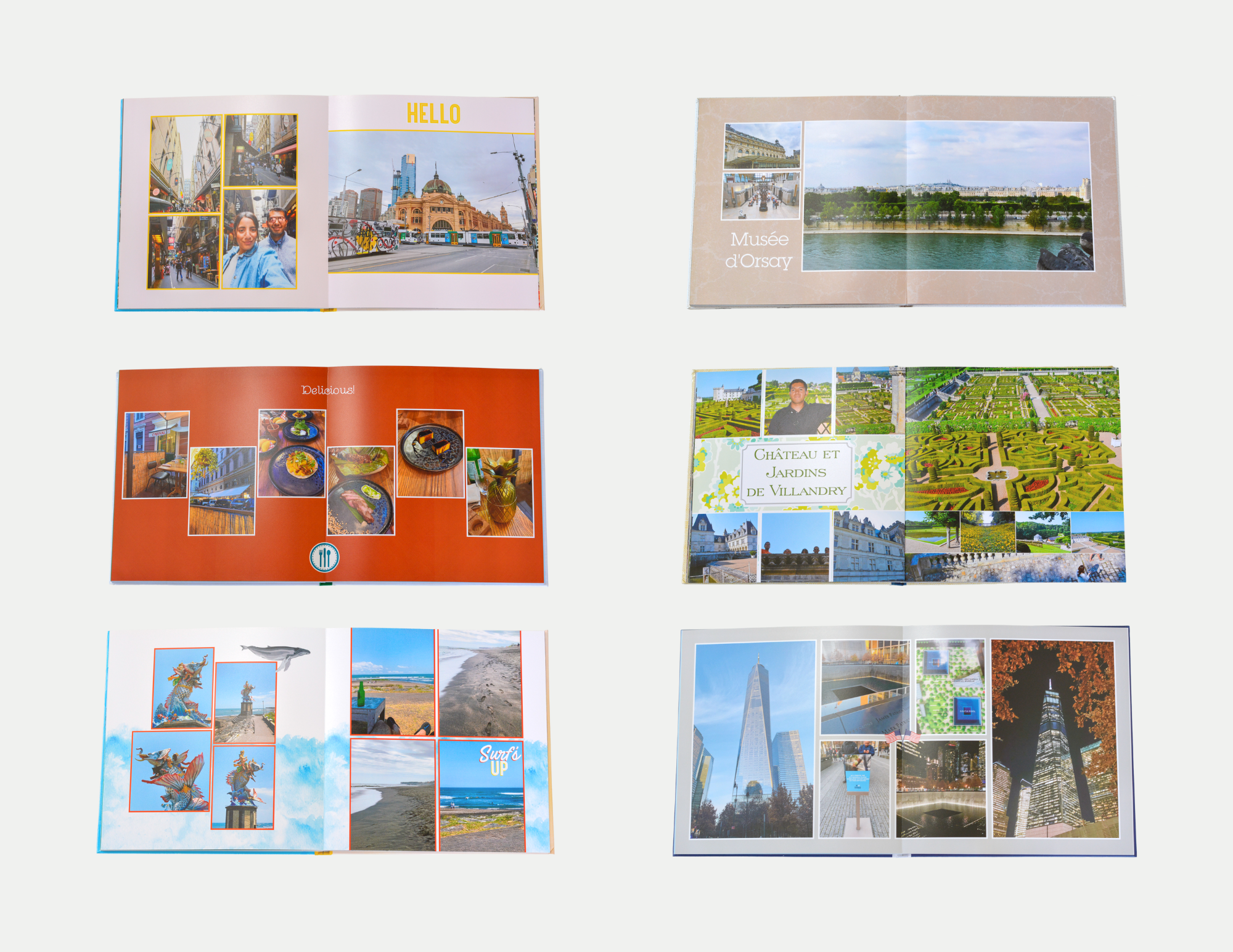
When it comes to photography it is not just about pointing and shooting. I believe it is necessary to tell a story with your pictures. I like to focus on frame composition, finding the best angles of a person, and capturing the perfect moments.
photo books
Part of my photography philosophy when taking shots is finding a way to tell a story, which can include setting the scene, noticing the details, discovering the hidden perspectives, and capturing the right moments while still being in the moment. My photo books follow the same simple and clean design seen in my other work. In our current digital phone age, photo books can be a great way to preserve and showcase photo memories for years to come.


